How To Design Printable Signs

Designing a printable sign is a thoughtful process that requires a combination of creativity, practicality, and attention to detail. Whether it's for an event, business, or personal use, a well-designed sign can effectively convey information and leave a lasting impression. Here's a comprehensive guide to help you create a compelling and printable sign.
1. Define Your Purpose and Message
Begin by gaining a clear understanding of who your intended audience is and the specific locations where your signs will be displayed. Knowing your audience helps tailor the design to their preferences and needs. Consider the type of places your signs will be placed, as the surroundings can influence design choices. In essence, comprehending your audience and the context in which the signs will appear is fundamental. This understanding allows you to create a sign that not only captures attention but also resonates effectively with the people who encounter it in different settings.
2. Choose the Right Size and Dimensions
Choose appropriate sizes for your designs based on the specifications of the printers you plan to use. Some printers may have restrictions on common sizes, so it's crucial to be aware of their requirements. Additionally, consider the diverse locations where your signs will be placed. Adjust the sizes accordingly to suit the specific needs of each location. Different places may demand varying sign dimensions for optimal visibility and impact. Adapting the sizes to the requirements of each setting ensures that your signs are not only visually appealing but also compatible with the printing equipment you intend to utilize.
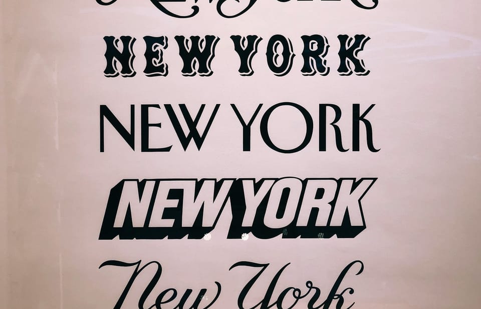
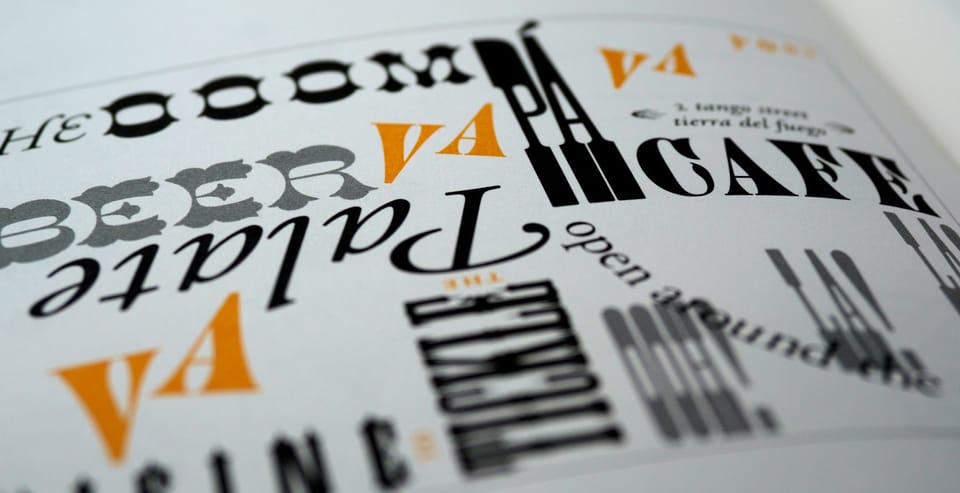
3. Select a Legible Font
Choose artistically attractive fonts for your sign, as the font plays a crucial role in capturing the viewer's attention. Selecting the right font is essential, as an inappropriate choice can render the sign ineffective. Additionally, consider the font license, ensuring you have permission from the creator to use it. If you prefer free fonts, opt for royalty-free options to avoid any legal complications. By prioritizing both aesthetic appeal and licensing considerations, you ensure that your sign not only looks visually appealing but also adheres to the necessary legal and creative parameters.
4. Contrast is Key
Consider the variation in lighting between day and night when designing your sign. Pay careful attention to the contrast to ensure visibility. A low-contrast sign may go unnoticed. Optimal colors for enhanced visibility in both day and night settings include green, yellow, black, and white. These colors stand out effectively, ensuring that your sign remains noticeable and legible regardless of the time of day. Striking the right balance in contrast and color choices is essential for maximizing the impact of your sign in different lighting conditions.
5. Incorporate Images and Graphics
Enhance understanding by incorporating simple illustrations and images into your design. Keep the illustrations straightforward, avoiding unnecessary complexity. When selecting images, prioritize royalty-free options to ensure you have the right to use them. Alternatively, consider designing your own illustrations to add a personal touch. This approach not only simplifies comprehension for the audience but also prevents any legal concerns associated with image usage. By opting for clear and uncomplicated visuals and adhering to royalty-free guidelines, you contribute to a visually engaging and legally sound design.
6. Create a Hierarchy of Information
Emphasize key details on your sign through a well-defined hierarchy. Give priority to elements such as colors, fonts, and the message itself. Establish a clear order of importance to guide viewers seamlessly through the information. By prioritizing these components effectively, you ensure that your message stands out and is easily absorbed, contributing to a more impactful and visually organized sign.
7.Utilize White Space
In sign design, it's vital to embrace white space, also known as negative space, to avoid visual clutter. Providing enough empty space around text and graphics ensures a clean and uncluttered look, enhancing the overall readability and aesthetic appeal of your sign.
8. Consider the Printing Material
Select the right material for printing your sign based on its intended use. For outdoor signs, weather-resistant materials are essential. Indoor signs may benefit from high-quality paper or cardstock. Discuss with your printing service provider to determine the most suitable material for your specific needs.
9. Check Resolution and Quality
Before sending your design for printing, ensure that it has a high resolution. Low-resolution images can result in a pixelated and unprofessional appearance. Aim for a resolution of at least 300 dots per inch (DPI) to guarantee sharp and clear prints.
10. Proofread and Test
By following these steps, you can create a well-designed and printable sign that effectively communicates your message. Remember to adapt your design choices based on the specific context and audience for optimal impact.